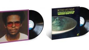
Proposed Analog vs. ADA Reissue Cover Art Needs Your Feedback

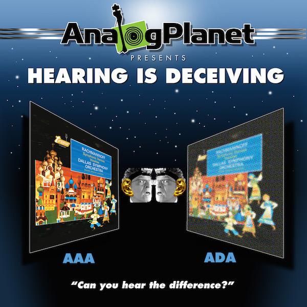
This is a serious endeavor and an interesting experiment but it also ought to be fun so here's the proposed cover art. What do you think?

COMMENTS
Zardoz's picture

I really like the Fremer heads.

Z

vince's picture

The front cover is largely irrelevant. What you have is probably sufficient. The back cover is the more important cover, in my opinion and should contain a description is what is being done and how one can participate in the experiment. You may want to include the answer to the riddle in an envelope inside the jacket so somebody can determine what side used what chain long after the original is pressed.

I am very glad to see that this project is moving forward.

Michael Fremer's picture
Maybe, but it should aid sales. The back will of course include a detailed description of the production process (etc.)..... As far as how the identities will be revealed, still mulling that one..
audiof001's picture

Still, most of us do pick up an LP based on the cover. As a designer, I think you can do better than this mock up. I pray you're not laying this out in MS Word.

audiof001's picture

Perhaps using the Mosaic filter to render the digital version in a grid of large color boxes rather than what looks to me like a bitmapped version... or overlapping the variations straight on rather than in perspective and showing portions of the nice analog cover rendered in Photoshop's Mosaic filtered boxes of color.

Michael Fremer's picture
I didn't do the layout but the artist who did based it upon my ideas. I like it. But feel free to come up with something better...
martinjohnbutler's picture

Funny.

Joost's picture

Is that how they call your followers? Artwork is ok!

Auric G's picture

Ixnay the Fremer heads, replace w/ hot young babe listening to a pair of headphones.

Michael Fremer's picture
good idea! But I come from the "you are a sexist pig" 60's/70's
JohnnySpinVinyl's picture

Don't do the sexual babe reference ..even if it's funny, because when you are from the 60's-70's Era..at LEAST you are the real deal and won't have to fake being in-the-know with anyone here..or there.Sex in advertisement has sold-out.

The golden ears bit, that facial expression of yours - is someone turning you into a new Spock?

mraudioguru's picture

...looks fine to me.

Spin Lps's picture

Looks great, but why the Go Pro on your head? That's video, a visual thing. I thought this is all about sound. Then again I have not been able to attend any audio shows. Maybe that is the way most people see you?

Michael Fremer's picture
I think it's funny with the Golden Ear and the crazed look...that's all.
OldschoolE's picture

I like it! Hey, how about making those headphone holders?!! Yes, there it is, Fremer headphone holders!!!
I just couldn't resist Michael, it's too good. :)

homersoddishe's picture

fuzzy ADA side. It's not A MP3 A.

homersoddishe's picture

What I meant to say was, I like it aside from the fuzzy ADA side. It's not cut from an MP3 after all.

JoeESP9's picture

Why does the ADA side look pixelated?

Hats Domino's picture

Because that's what we're supposed to believe the digitally sourced side will sound like.

Goochified1's picture

If the idea is that a listener may not be able to tell the difference between AAA an ADA then both covers should look the same. By having them different you're pre-supposing that ADA sounds worse than AAA.

Hats Domino's picture

Agree completely. What is this, Faux News?

Michael Fremer's picture
But, the identities of the sides will not be revealed so the cover art expresses a popular contention that digitization is not transparent to the source. That's the point of the exercise! I'm good with the artwork. Had they both been identical, with no pixelization, well that too would be "editorializing"!
Michael Fremer's picture
But, the identities of the sides will not be revealed so the cover art expresses a popular contention that digitization is not transparent to the source. That's the point of the exercise! I'm good with the artwork.
kronning's picture

...unless they will help fund this project. And, no side A or B on labels in case some party pooper spoils our fun by Internet reveal. Cryptic deadwax info we can look at when we're ready.

Michael Fremer's picture
Cryptic wins!
Hats Domino's picture

Showing a pixilated ADA cover is about as unbiased as Fox News.

Hats Domino's picture

Technically, this would be AAA v. AAA since the SPARS code doesn't have the ability to differentiate an analog mastering from a digital source of an analog mix.

JohnnyCanuck's picture

The AAA version is clearly more focused than the ADA version. You wouldn't be attempting to influence perceptions, would you Mikey?

Michael Fremer's picture
Express long-held beliefs among many—myself included. While this will not be purely "scientific" I believe it will be useful!
azmoon's picture

Why show a bias? It could taint the exercise.

drdarkfish's picture

Regarding the front cover, I think you should just have the original cover - half as it should be (the original), half in hazy matrix of 0's and 1's that vaguely make up the form of the other half...

Regarding being able to tell the AAA and ADA vinyl sides apart, can't it just be a small variation in the matrix code?

That way you will only know which side is playing by looking very closely at the deadwax.

isaacrivera's picture

It's great.

homersoddishe's picture

which side is which is he, Michael? He'll also have to hide the original AAA cut's lead out inscription, I suppose. I'm confident in my ability not to tell, but I'm keen to hear what various folks hear. Cool project.

Martin's picture

I will definitely be picking up a copy.

PeterPani's picture

or made available vor download. So, we can also compare AAA and ADA with ADD. Please!

tubeular's picture

Just my opinion but I think the test in offering this product should be whether anyone who doesn't already agree with us about analog recording and vinyl playback would look at this, pick it up and pay for it to see for themselves. I thought this was a project to be taken seriously by people who aren't already in the choir, even though it certainly doesn't have to be leaden and humorless. So I say sorry, please take goofy credibility destroying caricatures of you out of the middle of the front cover, put them in a corner of the back cover if you want to make a logo for future releases of "Mikey's" (TM) comparative and reference analogue trax. Also think it inherently looks unfair to have the pixelation of the digital side of the cover so overly strong. You aren't comparing AAA to MP3, so something suggesting much more subtle pixelation might be OK but people are supposed to be deciding for themselves objectively aren't they?

isaacrivera's picture

that someone who believes digital is better has a turntable to play this on? And how can the pixelation influence anyone if they don't know which side of the record is which? If you can't hear a difference it does not matter and if you can, and have a preference for one over the other, you will find out in time which is which, but how could the pixelation have influenced your choice? Is not like there is some magic connection between pixelated cover art and digital record side.

Zardoz's picture

Can't believe all the nit picking. If you are trying to show a pictorial representation of analog vs. digital, what better way than what Michael is doing? Haven't seen one person with a different idea for that.
Since no one will know which side is which, how does that bias anything? The whole purpose of the disc is to compare AAA and ADA so it's already "biased", if you insist on looking at it that way.
The Fremer heads are FUN. Some of you need to get a little more laughter in your lives.
End of rant.
Z

Goochified1's picture

Michael did ask us what we thought, so we did. I see MF's point that making both album covers look the same would also "taint" the viewer. How about one image of the original album cover and then on one side a digital looking player, on the other side a turntable, and both are pointed toward the original album art? And a question mark next to the digital player and the turntable? I'd be happy to put it together for you - I'm a graphic designer with many album covers to my credit.

Archimago's picture

I like this idea of turntable vs. digital player. I appreciate fun and humor - funny Fremer pic is fine IMO, but if there is even any real pretension of seriousness in this exercise, then there is at least a requirement to show some control against bias. Like others have said, we're talking 24/96 here, not low quality MP3!

IMO there is a real potential for digital sounding superior since some of the processing after digitization like applying the RIAA curve can be done in a more accurate way than the analogue domain. All depends on how Kevin Gray is doing this!

I think keeping this blinded (just Kevin needs to know) until say at least 100+ responses come in keyed to a serial number to weed out fake responses would be a great opportunity to be serious about this and can truly help answer the question posed.

isaacrivera's picture

my thoughts.

readargos's picture

That is the point of the exercise - we are challenging people to hear a difference and have a preference.

Otherwise, I like it.

michaelwcole's picture

Go for it!

thomoz's picture

Take out the faces and leave a single golden here in the middle, and you've got it.

pkf2's picture

I think the cover shows a strong anti-digital bias with the pixelated ADA art work. You’re fairer then this. Don’t poise the well before folks get to hear it for themselves. That B&W photo with the gold ears not good (ugly) delete it.

Rodrigo Lopez's picture

I like it.

weirdo12's picture

Should be pixelated to match the album cover.

JEB-42's picture

At first glance it was Meh.....Once you take a good look, you get the joke and appreciate the cover. I agree your image should be pixelated to match the album cover.

Looking forward to this!

Potty Knotty's picture

If you had just a plain black cover with the two album covers as they are, with a small white silhouette of "Analog Planet", you would have a classic album cover. Less is more! You could even make T-shirts.

Potty Knotty's picture

T-shirts......you could have a statement on the T-shirt saying "I can hear the difference". Two album covers, one in and one out of focus, with "I can hear the difference". I would buy that t-shirt.

tomd's picture

Love IT!

thirtycenturyman's picture

I have to admit, I'm not really a fan of the first draft cover above. Here's one that I threw together in Photoshop. Literally took a couple minutes so pardon the low quality image, but it was derived from an internet screen shot. Also, to give credit where credit is due, drdarkfish beat me to the zeros and ones idea in his earlier post.
https://drive.google.com/open?id=0B6Ldk_f3n01DekNLXzdkQk4ySFk

Ryan L.'s picture

That looks great! This gets my vote.

Michael Fremer's picture
Thanks for that!
thirtycenturyman's picture

The text in the prior post should read "Hearing Is Deceiving." HA! You get the idea though...

Paul Boudreau's picture

I'm a fan of the Ferengi but putting one on the cover is a bit of a trek.

MerckMercuriadis's picture

The cover art is fun. When will the kickstarter launch?

dconsmack's picture

Ditch the AAA ADA abbreviations for the cover but use them in the description. Use ANALOG and DIGITAL for the cover art.

jimhb's picture

Don't let people know, at first, what side is what. Then let everyone know two weeks after the lps have shipped.

jimhb's picture

Don't let people know, at first, what side is what. Then let everyone know two weeks after the lps have shipped.

hyman the david's picture

poor design in so many ways....

salvo's picture

I think the cover is too biased upfront. Pictures can speak a thousand words, but it obfuscates judgment.

X