And I have some experience. If there's one thing you learn very quickly in the advertising business, the customer is always wrong.
The Worst Print Ad Ever Created? (Not the One Pictured Below This Headline)
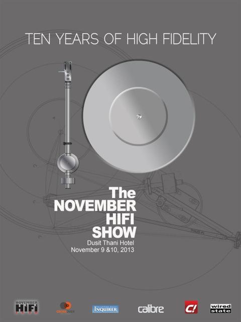
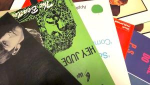
Look at this print ad for the Manila Hi-Fi Show I recently attended. It is a model of clarity, good taste and communicates effectively the event. Do you agree? I showed it to T.H.E. Show organizers and they mocked it and told me that their advertisements were excellent and that I don't know what I'm talking about.
Fine. I don't mean to pick fights. But being friendly does not mean sitting back and watching train wrecks. I mean to help elevate the industry as I can.
So last night I opened the latest edition of Record Collector News and there was the latest T.H.E. Show print advertisement and I think it's even worse than the original one I criticized, so I made a video that will clearly tick them off, but this is tough love, folks. They need some.
The ad violates every reasonable rule of print advertising: there's no focal point to catch your eye. The layout is really non-existent. The pastel color scheme is bland with no contrast and makes reading difficult. There's just too much stuff thrown haphazardly on the page and there's no central them tying it all together. "We Know Audio"? That's close but look where it is? And is that really the point? Isn't the point "Two Great Audio Shows in 2014 Produced by T.H.E. Show"? Wouldn't that be a good headline that could tie together the two shows? Couldn't both circular logos lived comfortably side by side as the item that catches your eye? Or SOMETHING to catch your eye?
What do you think—I'm especially interested in feedback from people involved in print advertising, art direction, etc. Am I wrong?
- Log in or register to post comments


Horrible
Submitted by torturegarden on Sun, 2013-12-15 12:06
Yes, this is pretty horrible. I'm not a designer, but am in the printing industry. The biggest problem is that it is way too busy. It looks like someone got a copy of MS Publisher and became a designer instantly.

It is a Bad Ad
Submitted by marcel_kyrie on Sun, 2013-12-15 12:07
You're right, it is a bad ad, and you are very bad with flags. The ad is both busy and mushy at the same time. What's wanted is simplicity and contrast. The reason you want this is because people don't like to look ads to begin with. So you need to catch their eye, and have them see at a glance what it's about.
If it's about Hi-Fi, you want a graphic that immediately says that, so that anyone interested in Hi-Fi is pulled in.
Ghastly Ad
Submitted by williamsims on Wed, 2013-12-18 10:34
An unholy mess. No wonder High End continues to be marginalized.
Less is more
Submitted by Ortofan on Tue, 2013-12-17 09:05
The ad looks like it was designed by a committee unfamiliar with the concept that less can be more.
The only item the ad for the Manila show really seems to lack is mention of a website for more info.
Yep. Awful.
Submitted by krell on Sun, 2013-12-15 15:01
I'm a professional designer, I've been working in advertising for a little over 25 years. The ad is, as you say, pretty hideous. A good ad should start with a strong, bold headline that communicates the 'message' clearly. A strong image/illustration that reinforces this message and then some sort of call to action should follow. You really have a small window of opportunity in a busy/crowded magazine to capture attention, although it must be said it is easier in niche publications where the reader spends more time and also re-reads.
Whatzit Advertising?
Submitted by AnalogJ on Sun, 2013-12-15 17:31
Yeah, that's pretty bad. No focal point. No ability to allow users to quickly discern what it's advertising. Perhaps it's for a tour to the United Nations?
atrocious
Submitted by apple2k on Sun, 2013-12-15 18:45
i actually work in branding in LA and these things are a yearly treat in the office, there are bubbles of text everywhere, no information hierarchy, little mention what THE SHOW (all caps = all awesome) actually is, and the coup d grace is that often the dates and location of the event aren't mentioned. an intern thought it was a discreet mail order bride convention

The only reason I posted this...
Submitted by Michael Fremer on Mon, 2013-12-16 08:17
It wasn't to beat them up. I approached them with my criticism of their last ad, which was not quite as bad as this one but still really bad, and I told them that while I was an audio reviewer and when I was in advertising it was radio advertising, I do know a few things about laying out a print ad (etc.) and it wasn't received well and there was even an argument over the validity of what I was saying, which is ridiculous. When I showed them the Manila ad they mocked it as something Apple might do and I said, "so what is wrong with that????? Quite obviously they've seen my criticism and raised it to a new level of ugliness, incompetence and a strong desire to appear cheap, which is the polar opposite of what high performance audio is about. The Newport Show is classy and they bring in the cars, cigars, wine bar etc. and then they promote it with that ad??? It's crazy...
Yes, it needed to be said but...
Submitted by Bob D. on Wed, 2013-12-18 16:08
Let's try and be conscious of the possibility it may be a family member who did this.
It is a bad ad, I've been saying so for 2 years. It needs to be changed. Too many vendors spend a lot of money and time on participating in T.H.E. Show to have a less then stellar ad to promote it. It is one of the best shows in the US and should have a logo and ad that live up to the rest of what they do right!

Yep, its ugly... very ugly
Submitted by kenkirk on Mon, 2013-12-16 11:16
That is the kind of ad that my eyes look past instantly. I will not focus on that sort of garbage. Too much print polution out there already. It is what it is. A mess. The video was a little sub par too.. :)
Ken
sub par video!
Submitted by Michael Fremer on Mon, 2013-12-16 12:17
It was done on a whim using my iPhone. Yes, it was shaky but I thought the entertainment value more than made up for that. No script. Purely spontaneous.
That ad is indeed...
Submitted by Synaptic on Mon, 2013-12-16 12:00
blisteringly awful. The ad for the Manilla show, while perhaps lacking in some executional fine points, is definitely aiming for the right target, both audience & aesthetics wise.
As a designer myself, I've found the lack of great examples of design in the hi-fi world a bit puzzling. In an industry that deals in 'the finer things' I would expect one could find some healthy doses of great visual thinking as well. It's there, but it's woefully outnumbered by the... not-so-great. I'm thinking of advertising & show promotional stuff as well as the visual identities of audio companies. What gets me personally when I come across a really pretty, well considered piece of audio gear that is marred by poor 'graphic design'. I see that a lot.

I completely agree..
Submitted by paul-s on Wed, 2013-12-18 15:23
Some high end audio companies have really sad branding. Manuals and support materials look like a school homework assignment typed out in Word. I think it's especially sad when you have an otherwise-attractive piece of equipment with an amateurish logo and ugly typography marring its faceplate.
Terrible Ad
Submitted by kozy814 on Mon, 2013-12-16 12:05
Yep -- Abysmal print ad. As others have said, a clear example of the customer dictating the design. As a former print advertising professional, I can tell you this page does indeed break almost every conventional rule of good quality graphic media design. It makes many assumptions on what the target audience already knows about the topic being advertised. It also makes garish and gratuitous use of non-sequiturs, which is the kiss of death in advertising. At first glance, I would think this is an ad for a travel agency... The adverstiser must be an aficionado of world travel and cruise vacations. The one thing you would hope is clearly communicated, that the show will feature high-end audio products, is thoroughly lost in the presentation.
No Winners Here
Submitted by burnspbesq on Mon, 2013-12-16 12:30
Richard and Bob get their backs up and don't benefit from well-meaning advice.
Mikey comes off as a busybody and a know-it-all.
Sigh.

beyond awful...
Submitted by vinyl listener on Mon, 2013-12-16 16:51
... probably designed by a "professional" who got handsomely paid.
we all bow...
Submitted by vinyl listener on Wed, 2013-12-18 15:51
... to your 30 years of award winning experience.

Lol. Hillarious comment from
Submitted by abhimawa on Wed, 2013-12-18 01:21
Lol. Hillarious comment from Michael Fremer. Luv it.
Agree that it is the one of the worst print ads I've ever seen. El cheapo design with unclear message
CRAP, CRAP, CRAP!!!
Submitted by DerwynGoodall on Wed, 2013-12-18 06:57
As an award-winning graphic designer & creative director with over 30 years of experience, I have seen a lot of "amateur" or "bad" design. How does this happen? a few reasons come to mind. Firstly, visually illiterate people think they are designers. Hey I have a computer, so I can do it! Secondly, I don't want to spend the money to do it properly. There are other reasons of course but these are ones I run into regularly. The visual communications industry is cheapened and undervalued far too often.
Michael is right. There is no visual hierarchy. The messaging is garbled. Way too many fonts. The colours remind me of toilet paper packaging. Need I say more. Yes, because I can. The thing is damn UGLY!
This Reminds Me...
Submitted by WINDIANRECORDS on Wed, 2013-12-18 09:18
This entire ordeal reminds me of a great David Thorne piece about design ...
http://www.27bslash6.com/brochure.html
"I often tell my offspring that he is talented despite the artwork on our refrigerator clearly illustrating the opposite. I commended him last week on an excellent representation of an octopus only to find out that it was meant to be a car. Unfortunately, confidence through encouragement does not automatically equate to capability. If I were to use my offspring's artwork on a brochure for the Ford Motor Company, feedback comprising of "Is that a f*** octopus?" would be far more likely than "This will sell a lot of cars, just add some clipart of a man holding a clipboard and a blue wiggly line and it's good to go."

They've always been bad.
Submitted by my new username on Wed, 2013-12-18 10:15
Here's what I think of when I recall the ads I've seen for T.H.E. SHOW.
nebulous images of large hotel building, random beach image, a pier
dates mentioned somewhere
who sponsors this?
Here's what I don't think of when I recall the ads I've seen for T.H.E. SHOW.
audio equipment; music
*************
The fact that they deride "Apple ads" despite the insane success of those is really telling.

Maybe not the worst print ad...
Submitted by dbowker3d on Wed, 2013-12-18 10:30
...but most definitely one of the funniest ctitiques I've heard for a while! And yeah, spot on about that it's a huge mess.
T.H.E. print ad
Submitted by rmarston on Wed, 2013-12-18 10:34
I currently work as a freelance graphic designer and teach graphic communications classes full time (for 15 years), have expert certification in Adobe Photoshop, teach the full creative suite as well as design principle and process, communications history, etc, and worked in the printing industry for 20+ years.
When I first saw the original T.H.E. ad I was horrified. It's "bukluk" (rough translation - crap). I have first year design students who adhere to the basic principle of design better that this ad does. This was clearly designed by someone with NO formal training (I hope).
I don't have enough energy to type all the reasons point by point why that ad and the new one really suck. They do.
Ron Marston
Ad designs
Submitted by Cybermynd on Wed, 2013-12-18 11:31
I worked in the Yellow Pages industry. You remember them? Same problem, the client always wants more colors, more text, more fonts! In short.... Manila - superb, T.H.E.- amazingly poor. Manila - Devialet, T.H.E.- Marantz 2325.

"Nephewtising"
Submitted by JonKranz on Thu, 2013-12-19 05:26
Awful. This looks like a classic example of "nephewtising": "Hey, we don't have to waste money on design. I got a nephew who's a whizz at that Adobe stuff; he'll do it for next to nothin'!"
Really Bad
Submitted by John C Freeman on Wed, 2013-12-18 11:54
Glad you told us that you made it with your Iphone. Yes the ad is really, really bad.
T.H.E. Bad Ad
Submitted by analog rabbit on Wed, 2013-12-18 11:56
Well the ad is pretty bad...unlcear and busy....but the video hurt my brain to watch...I hope the crappy lack of quality was intentional, and maybe an attempt at humor, although I wasn't laughing...my brain still hurts....

Oy veh, I'm crackin' up
Submitted by martinjohnbutler on Wed, 2013-12-18 12:11
Oy veh, I'm crackin' up here.
This is sad
Submitted by paul-s on Wed, 2013-12-18 15:09
In order to communicate (which doesn't seem to be their goal here), everything in a layout needs to support the message. Simplicity and clarity can be very hard work, and good work should should not call attention to itself.
To me, this looks like the designer or client is showing off—that seems to be the real purpose of this thing—but it utterly fails to communicate. A reader should understand where to look and what the ad is about if you expect to catch the reader's attention.
There is a famous essay about design called "The Crystal Goblet" by Beatrice Warde. She compares typography to an elegant wineglass, whose function is to hold and show off the wine but not call attention to itself. A true wine connoisseur sitting down to enjoy a rare vintage isn't going to pour it into a pretentious, jewel-encrusted monstrosity. The simple crystal goblet may be perfectly proportioned and beautiful, but because it does its job perfectly, you don't notice it at all.
Even if you read the text, T.H.E. SHOW ads are at best generic trade show ads; if you don't already know what T.H.E. SHOW is, you need to work at it to find out (and "home entertainment show" doesn't tell me that it's audio and video; it could mean Vegas showgirls will come to my house).
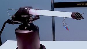
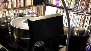
The Manilla ad shows a large image of a tonearm and platter. You immediately know what the subject of the show is, and this grabs your attention right away. Pictures of beaches and buildings don't tell me anything useful.
If the show organizers are trying to reach an affluent and sophisticated audience, this is a totally wrong approach.
Ad for What?
Submitted by jkingtut on Wed, 2013-12-18 17:49
Your accents were hilarious. Don't you of all people know by now that (ok almost) everybody in the high end (and I left out the caps on purpose) is always right? Pompous overbearing and the worst listeners (and I don't mean music) but right.
More of the same from T.H.E.
Submitted by brucej4 on Thu, 2013-12-19 12:49
Every print ad and web page that T.H.E. has ever produced screams "This is a cheesy, low-budget show that is not worth your time and money." It's kept me from ever attending, even though I'm only a few hours away. It also doesn't help when the show reports from Stereophile and others are never positive enough to overcome the bad impression that the "publicity" has created.

Pass the Motrin!
Submitted by Rudy on Fri, 2013-12-27 20:07
As a former full time web developer, I can relate to this type of trainwreck. Even my ancient sites from 1995 (made for my own amusement...and learning) were the "kitchen sink" variety. You added something because you could! Now I value white space more than anything.
I don't know if anyone else here could find it, but I seem to recall a cartoon out there on the Interwebz. There is a business owner that hires a web design firm to redesign their site, which is essentially a trainwreck like this T.H.E. ad. The firm designs a new, clean, professional site, and shows it to the client. Looks great! But the client wants something added. Then their aunt (or sister, or cousin...you get the idea) used to work in some form of retail or advertisng, so they "know" that other elements should be added. And I'm pretty sure that in the last panel of the comic, the "new" site is essentially exactly the same as the one they started with! :D
While it was India that pretty much killed off my business (I cannot compete with $4/hr. labor, despite it being of horrible quality--clients didn't care), I also ran into quoting situations where I'd get a response such as, "Oh, my brother designs web sites, he's going to do it for me for free." The end result screams "Microsoft Front Page" (for those who remember its atrocities ;) ). I can even think of some so-called high end audio manufacturers whose sites are so unprofessional, or so full of errors and/or dead links that it makes you wonder how they can run a business. And makes me wonder how T.H.E. can even be a success pulling in more attendees with an ad like this.
I agree. More cowbell....errrm, flags. :D

Agree, sadly
Submitted by JL777 on Wed, 2014-01-15 13:55
Michael, I have to agree with you. In fact, I've noticed the terrible copy design of T.H.E. Show for some years. It's a bit of an embarrasment to the industry, and I say this not as a hater, but as someone who would encourage the operation to raise their bar -- significantly. JL

Horrible Ad
Submitted by innergrooveblues on Wed, 2014-01-15 19:47
You are correct! The ad is chaotic visual mush. But sad to say, it is representative of what appears to be coming fashionable in the print media. I've cancelled and not renewed subscriptions to magazines that have fallen prey to this madness. I'm not a graphics professional and one doesn't need to be to recognize an orderly and legible presentation, or the opposite. Call me a pessimist, but I don't expect to see an improvement.
It Worked
Submitted by Gstanley75 on Mon, 2014-04-07 14:15
Mikey,
It might be bad, but it worked. It pissed you off and you have it a couple of minutes air time and got lots of responses on your blog and I think you have a greater readership than most of the mags they used to run the ad. ;-)
What T.H.E. . . . . !
Submitted by Stereonut on Fri, 2014-08-08 18:56
This ad could be famous one day as an example of how to ruin a brand! Obviously T.H.E. show don't value theirs.
I’ve been in the adverting industry for over 50 years and have never seen anything like it go to print!
I wonder who they think they’re trying talk to? I’d love to see the creative brief.
It's possible your age is
Submitted by KeithWrites on Tue, 2014-09-02 13:07
It's possible your age is showing (mine too). It's colorful, distracting, full of data, but not much information - in other words, perfect for Generation...(XYZ) whatever. The current group of young folk that they HOPE have money - but are in fact mostly unemployed and living in mom's basement.
I tend to throw that kind of stuff out, assuming it's aimed at people who can't be bothered to read.


| Equipment Reviews | The Gruvy Awards | Blogs Analog Tips | Columns Music | Show Reports | News Resources |
 © 2025 AnalogPlanet
AVTech Media Americas Inc.
All rights reserved